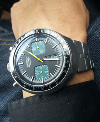
I am thinking the tilting is on purpose! It is meant to have a better alignment for the eyes, imo.
Look at this insert pic of a New watch launched, the number "12" without tilting in-between 1 & 2 makes it look slanting to my eyes! Gaping below the 1 & 2 of the number "12" looks different.